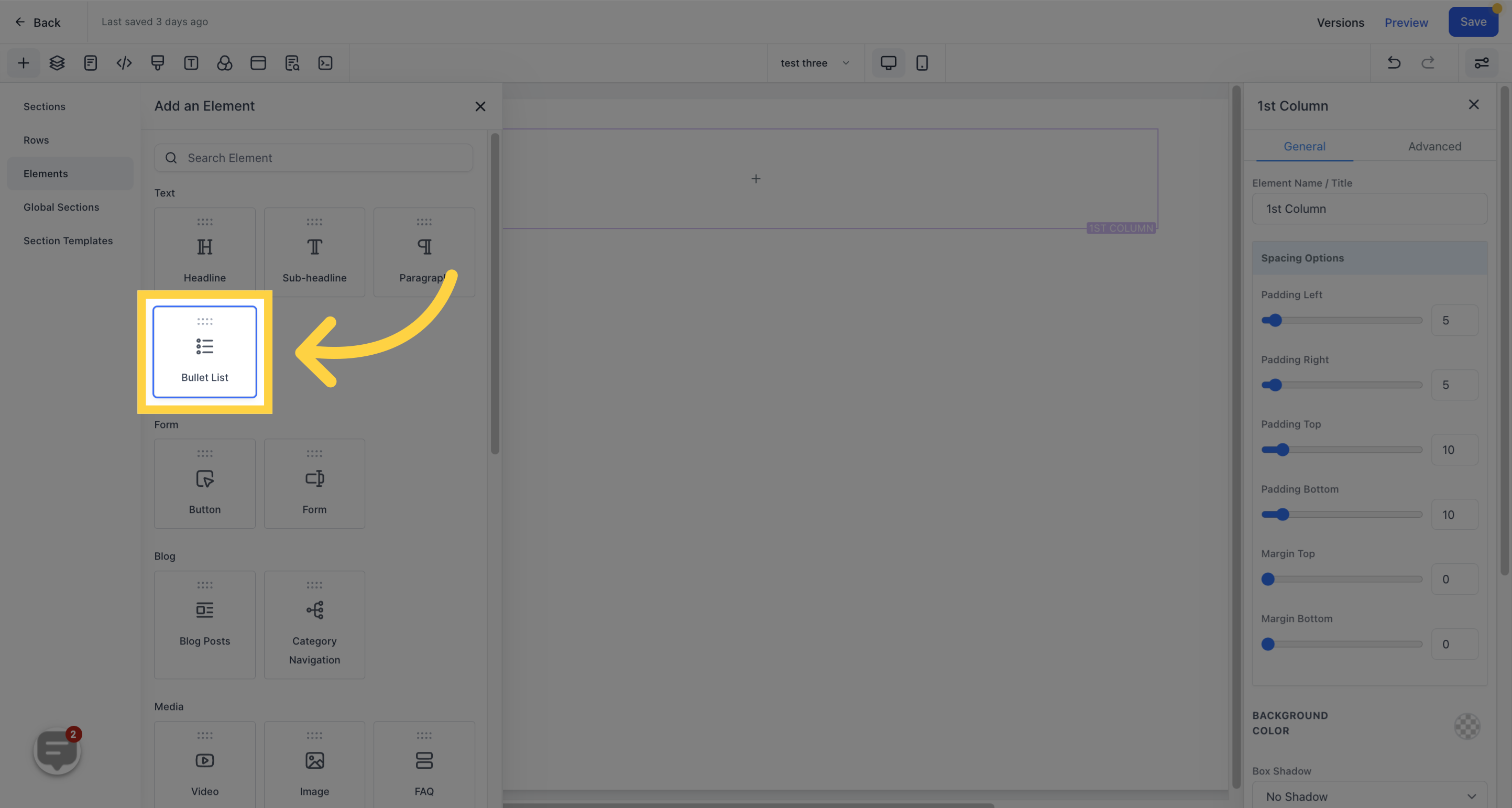
The Bullet list is a useful tool for displaying the contents of a page in a clear and concise manner.
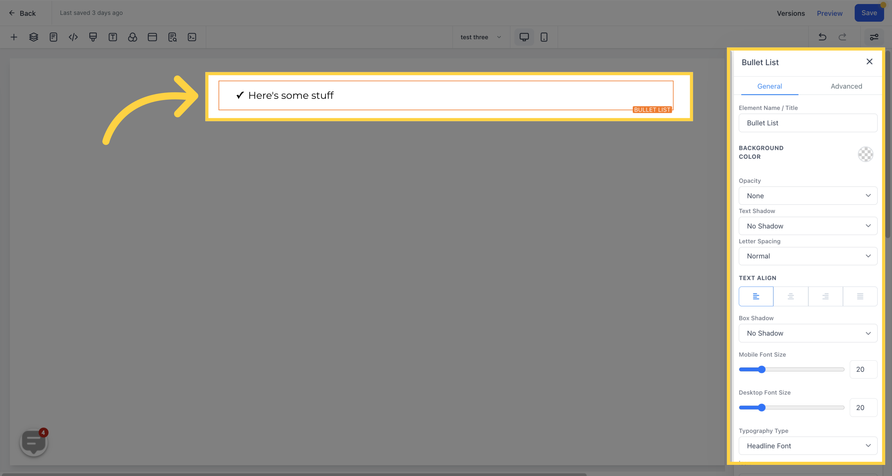
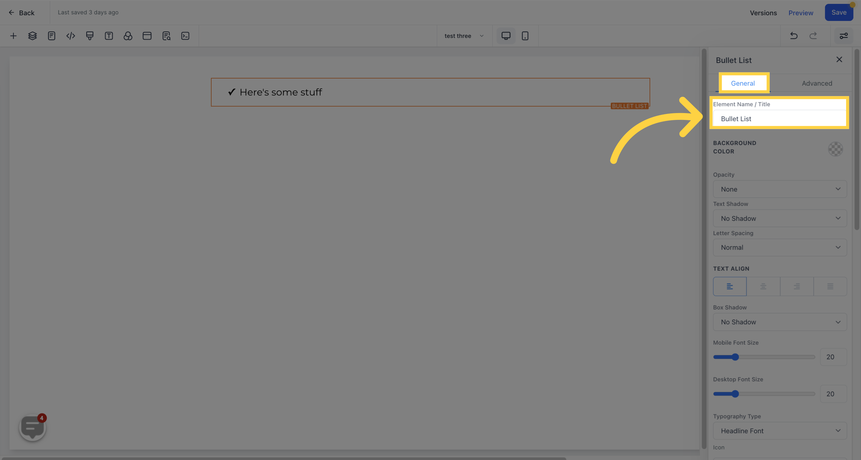
This option displays the default name/title of the edit option you are working on. You can choose to leave it as is or rename it.
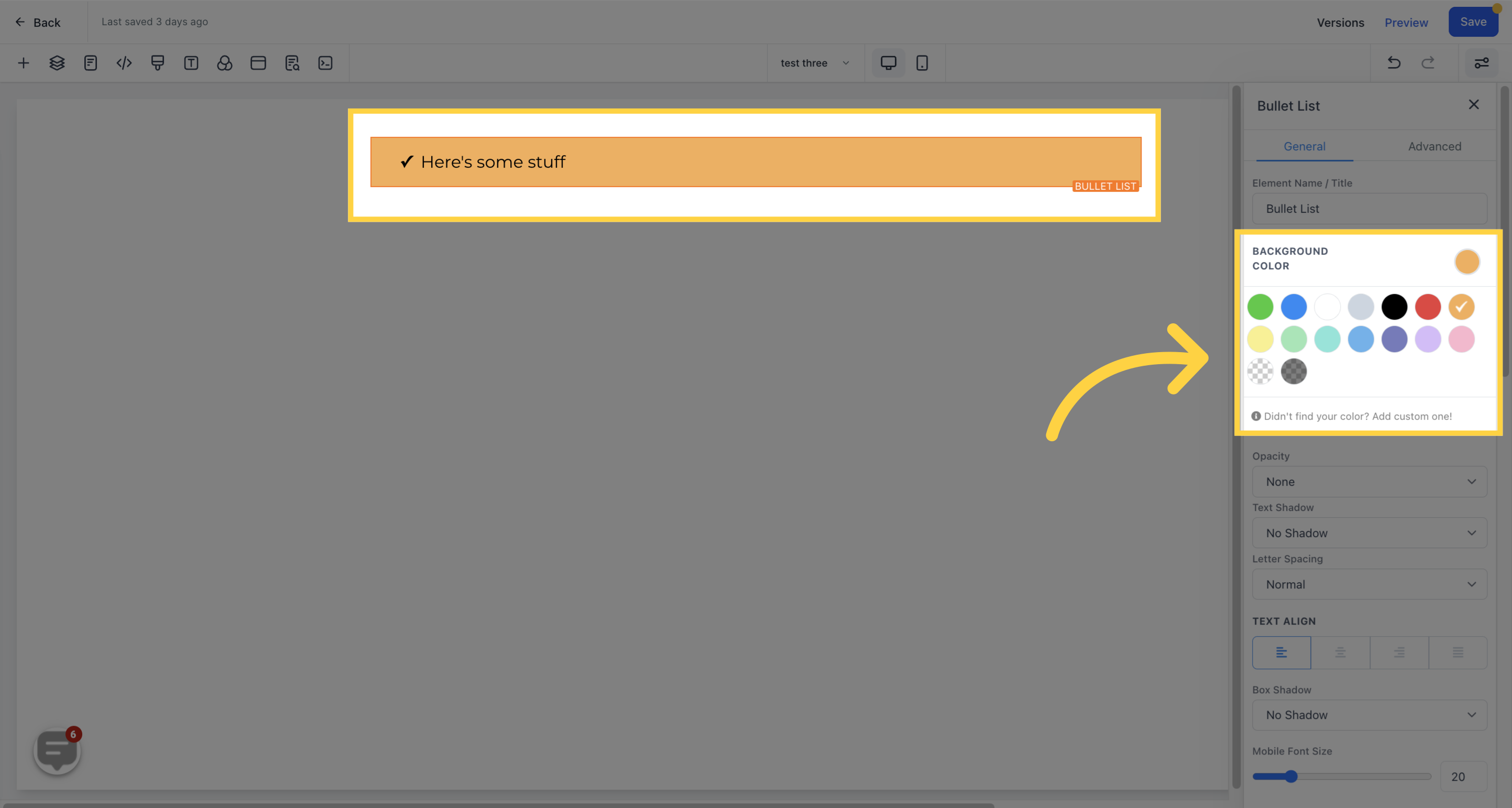
You can change the background color of a specific edit option such as the section, row, column, or elements by clicking on the content and adjusting its color.
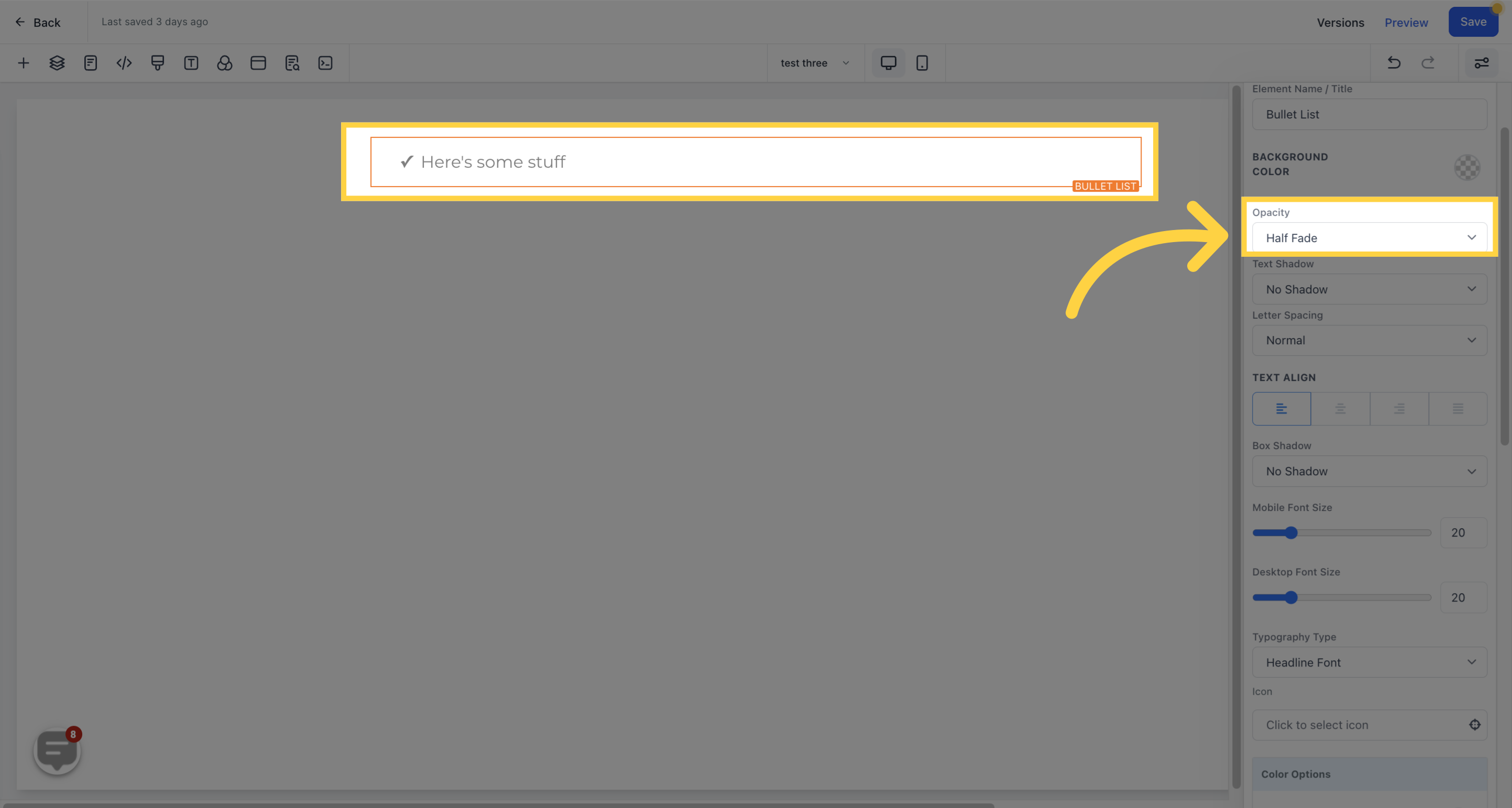
You can control the extent to which your text/content fades in each element box by adjusting the opacity from none to heavy fade.
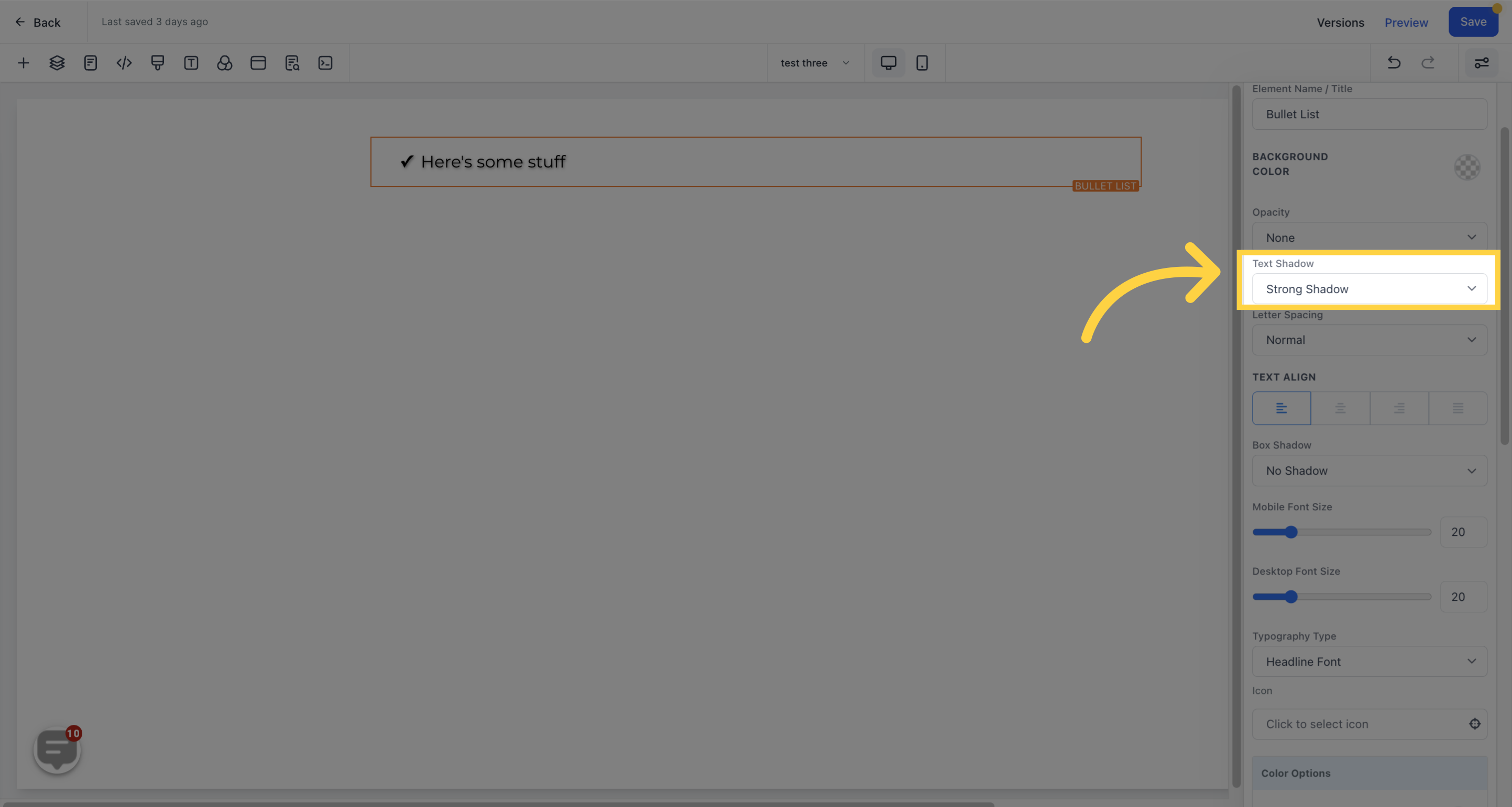
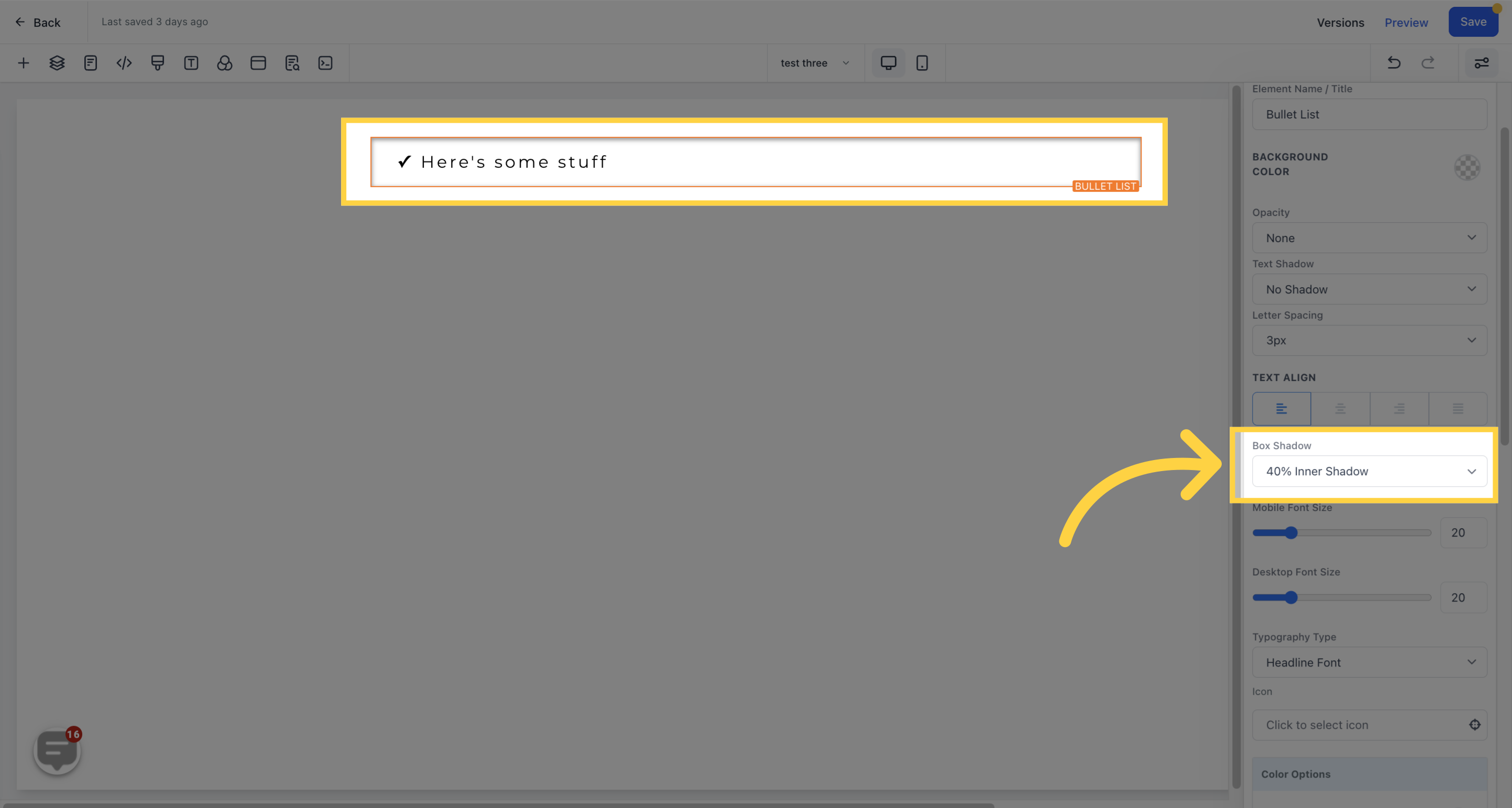
Add a shadow to your text/content by selecting the desired thickness or lightness.
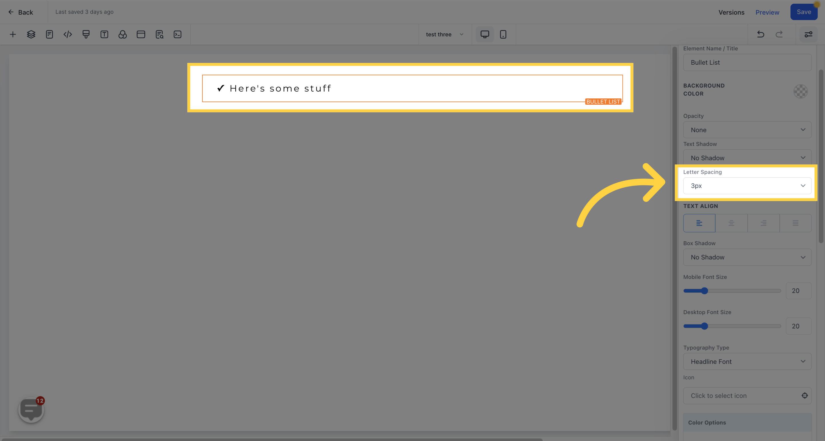
Adjust the spacing between your letters to your preference.
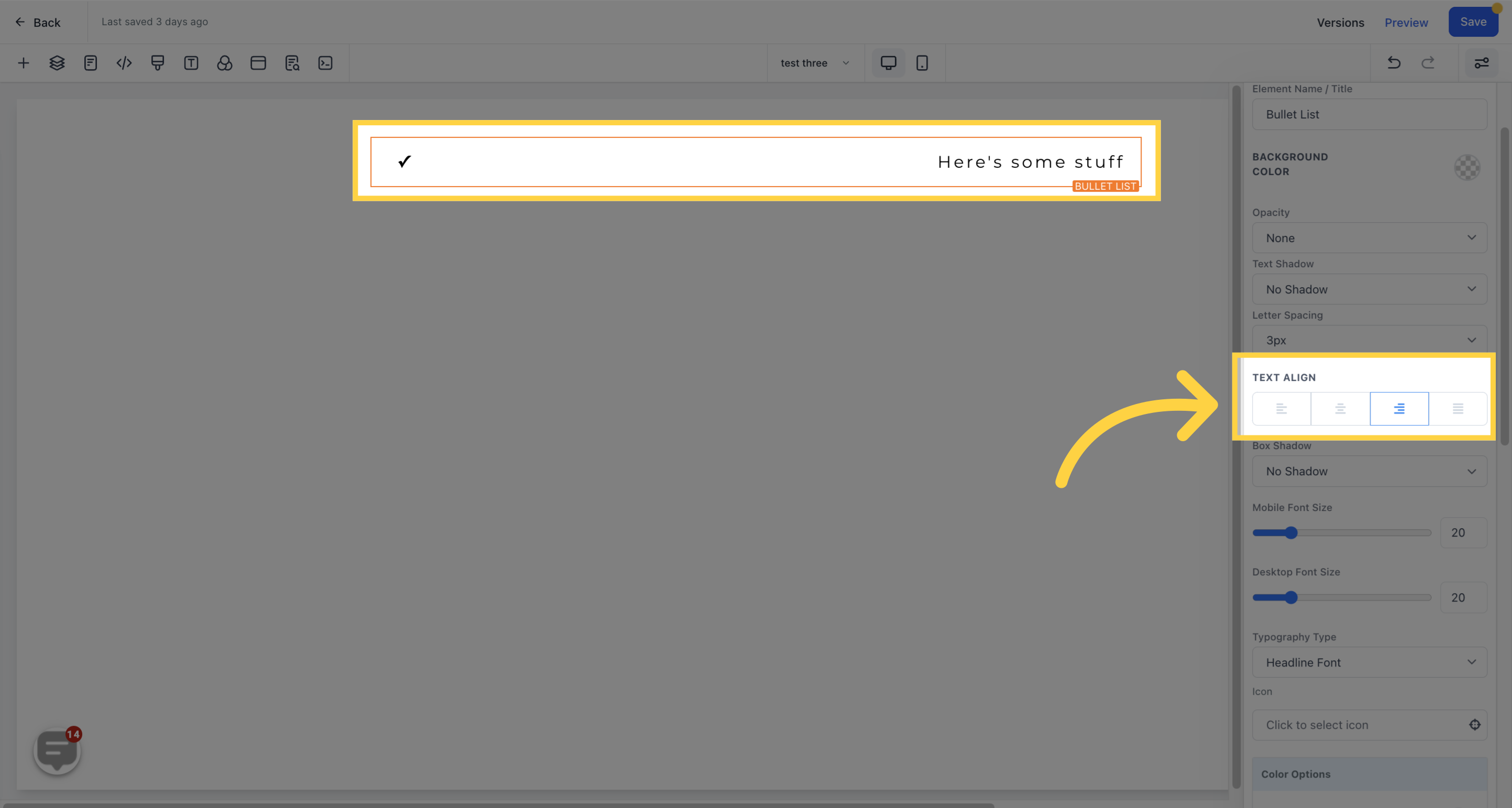
Move your text to the left, center, right, or justify it.
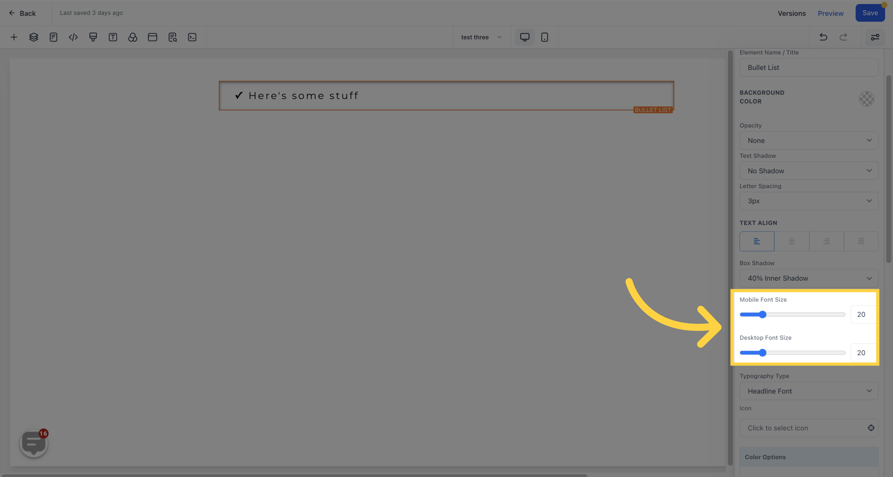
Adjust the font sizes of your text/content for both mobile and desktop viewers.
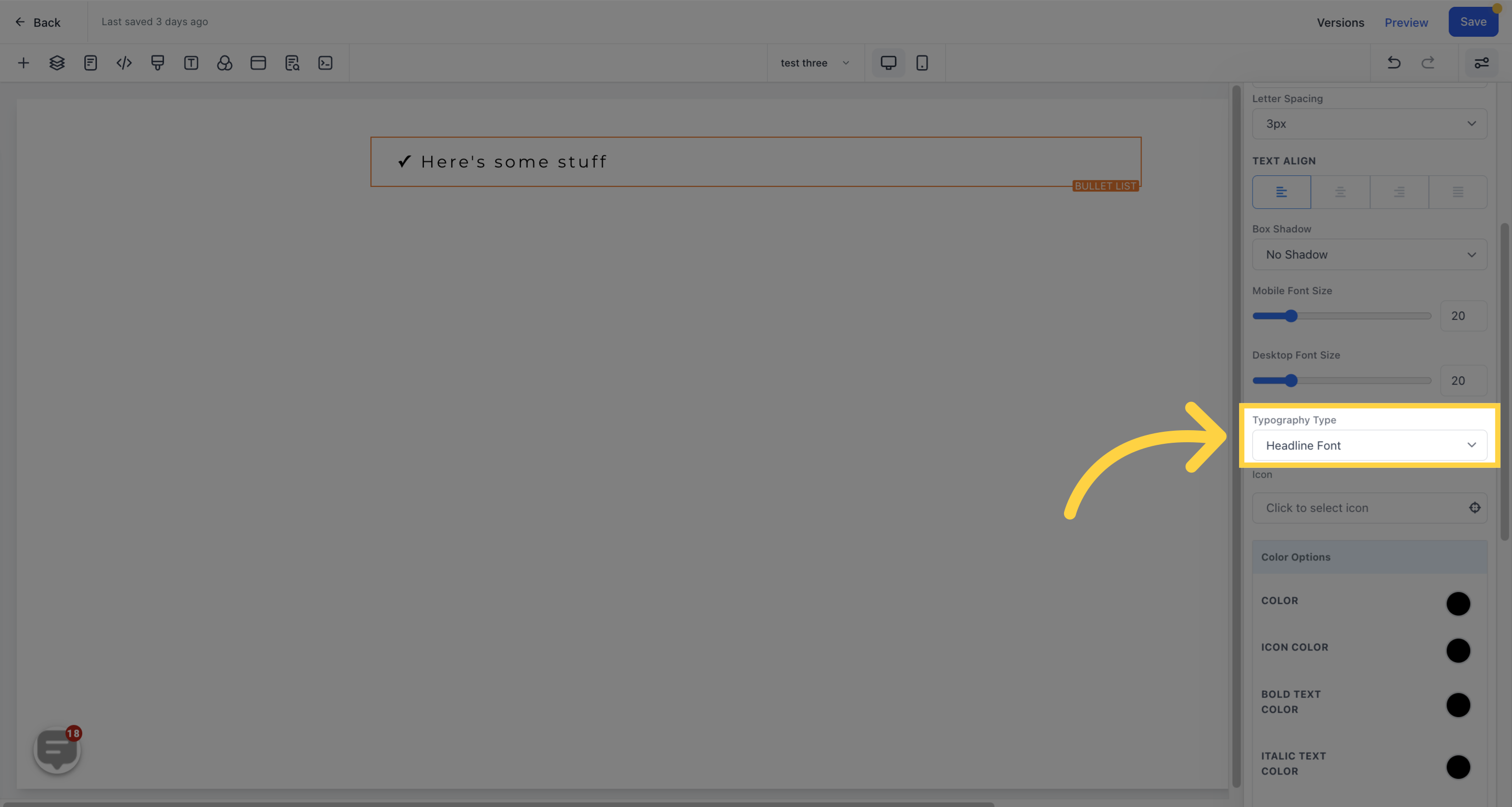
Choose the font type for your text/content.
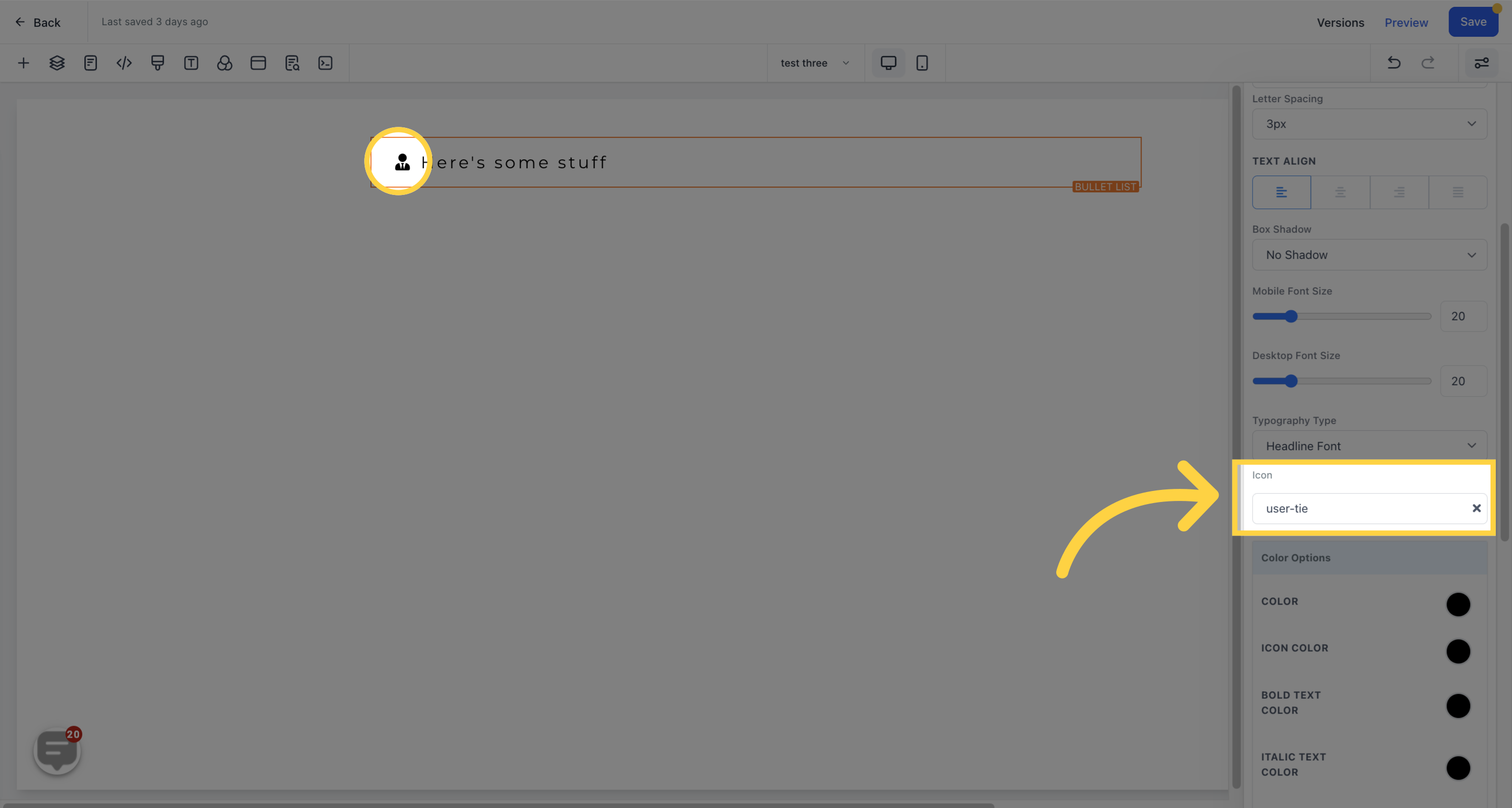
Add an icon to your page from a selection of available options, or type in your desired icon in the search bar.
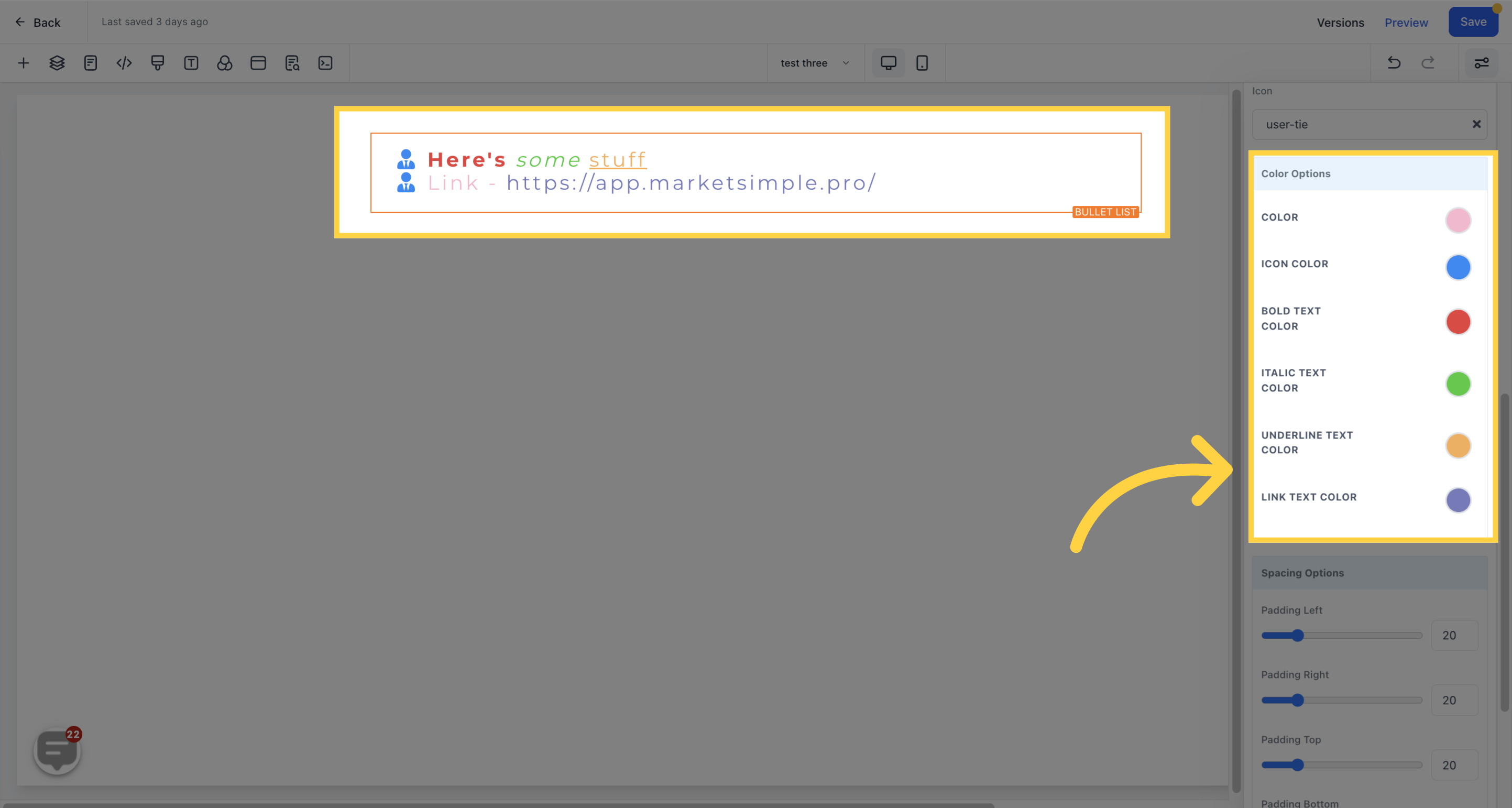
Edit the color of your text/content, including bold, italic, underline, link, and icon colors.
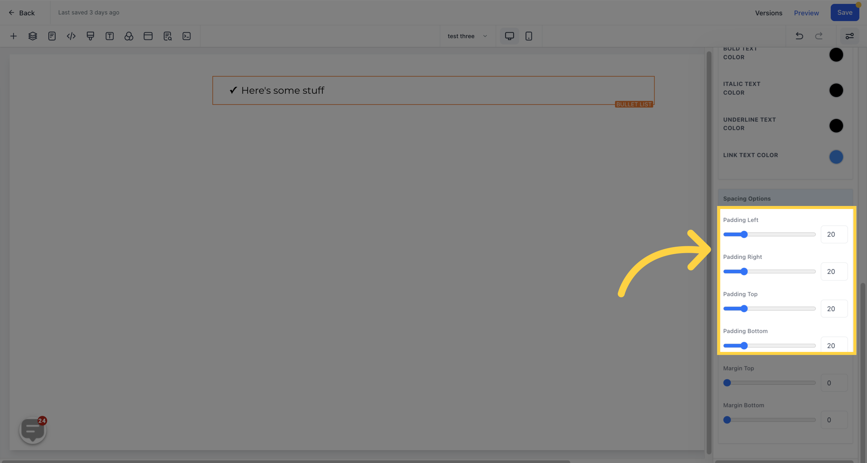
Choose from different spacing options to adjust your content. The settings will only be applied to the specific edit option you are working on.
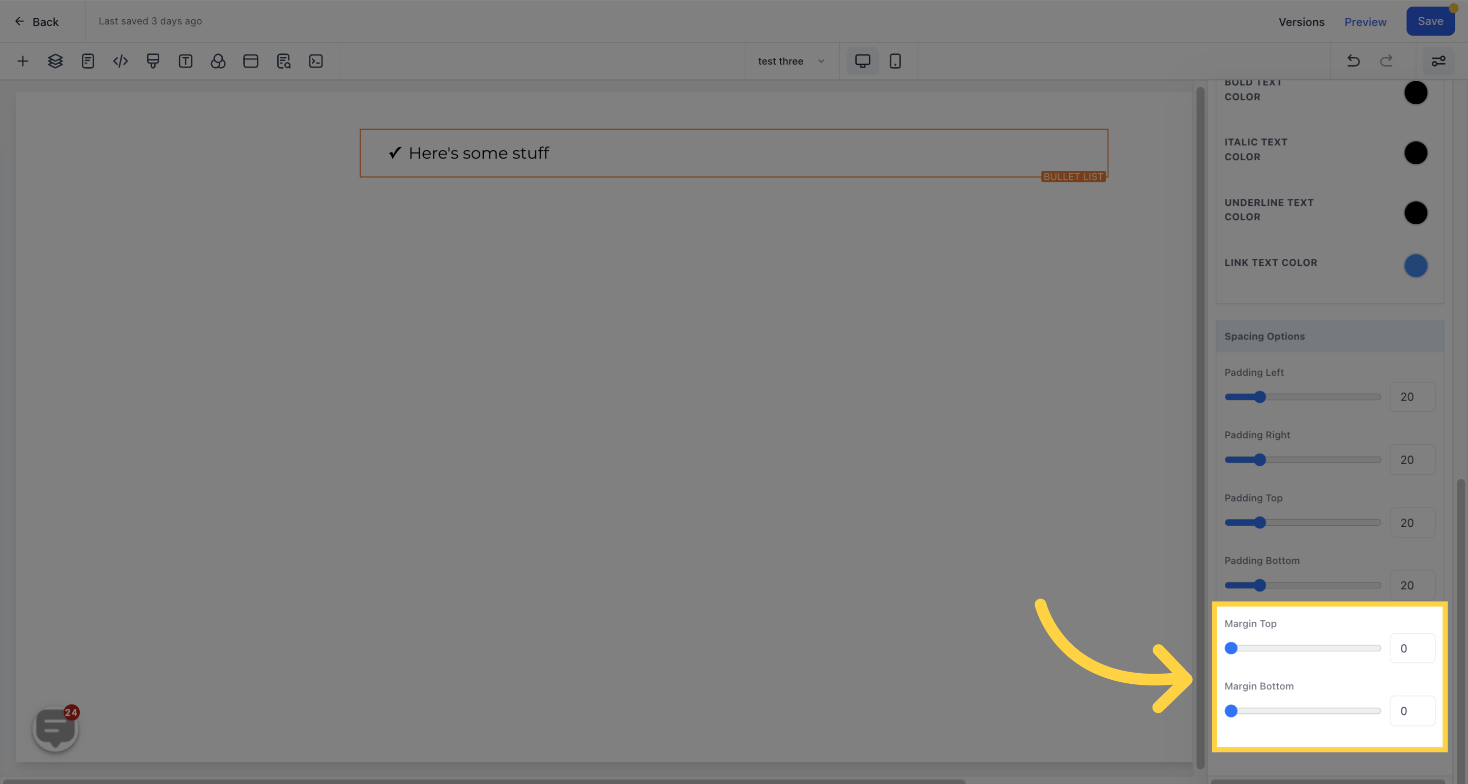
Move your content to the left, right, top, or bottom by toggling the corresponding toggle bar.
Adjust the top or bottom margin of your content.
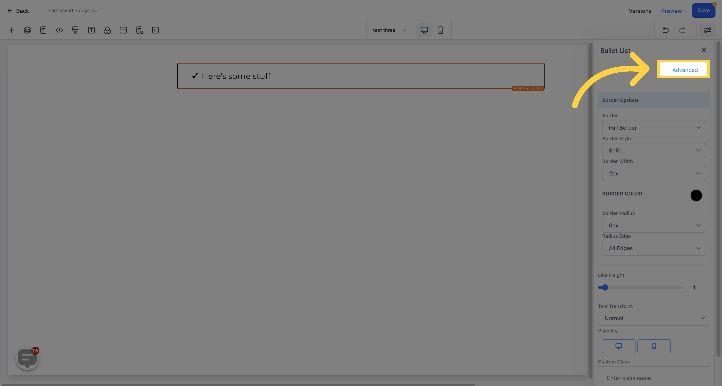
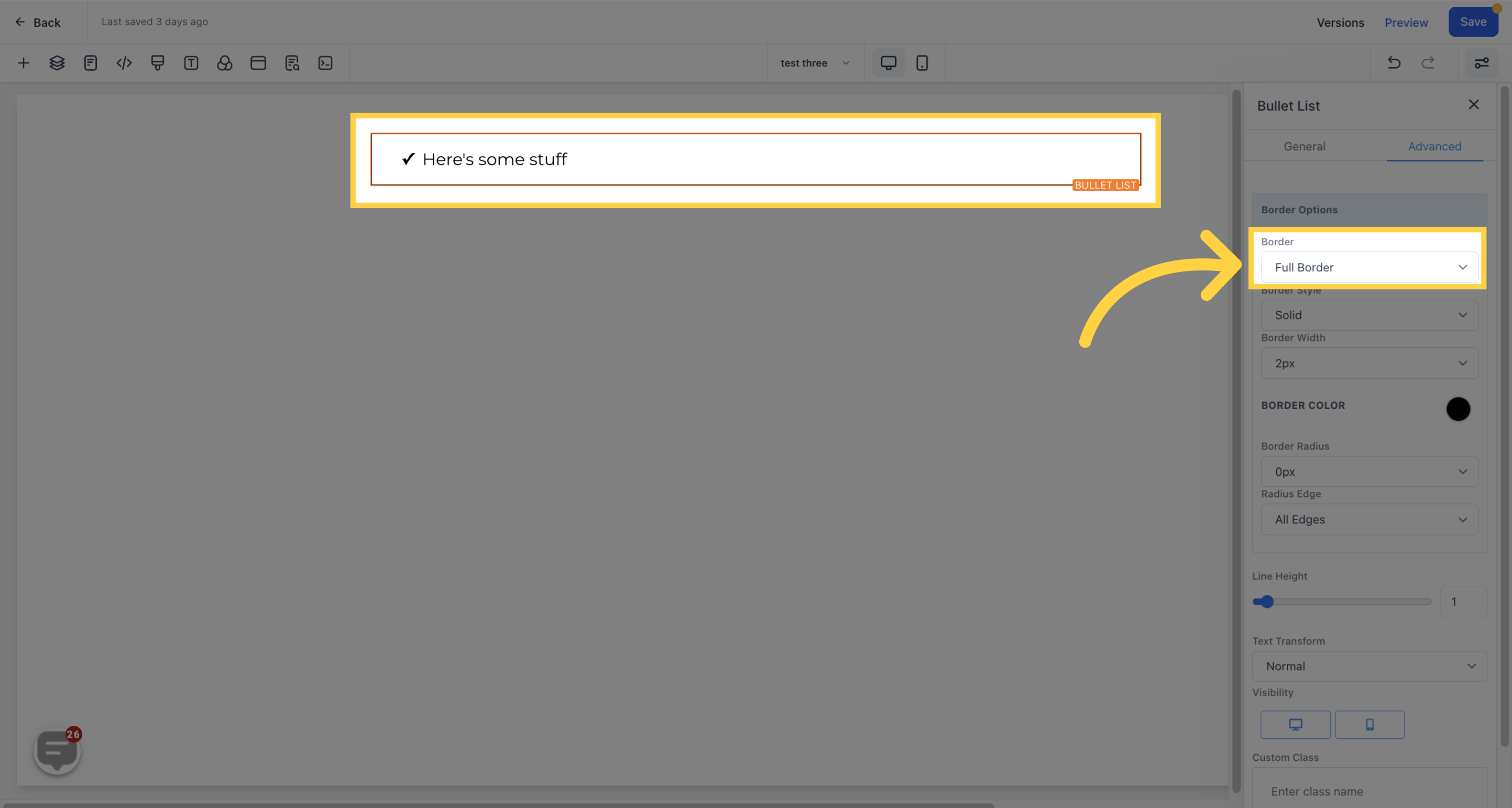
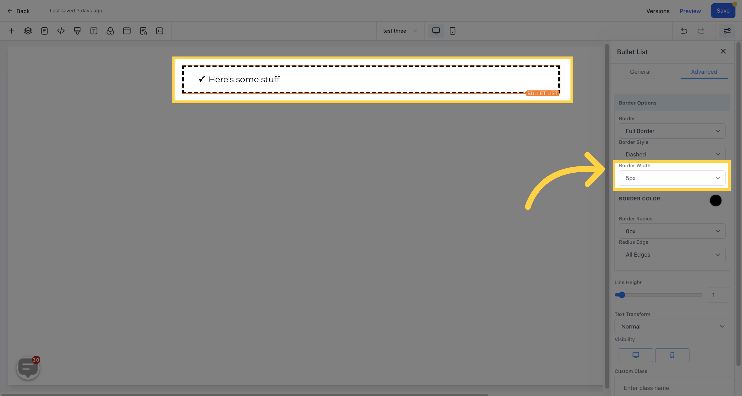
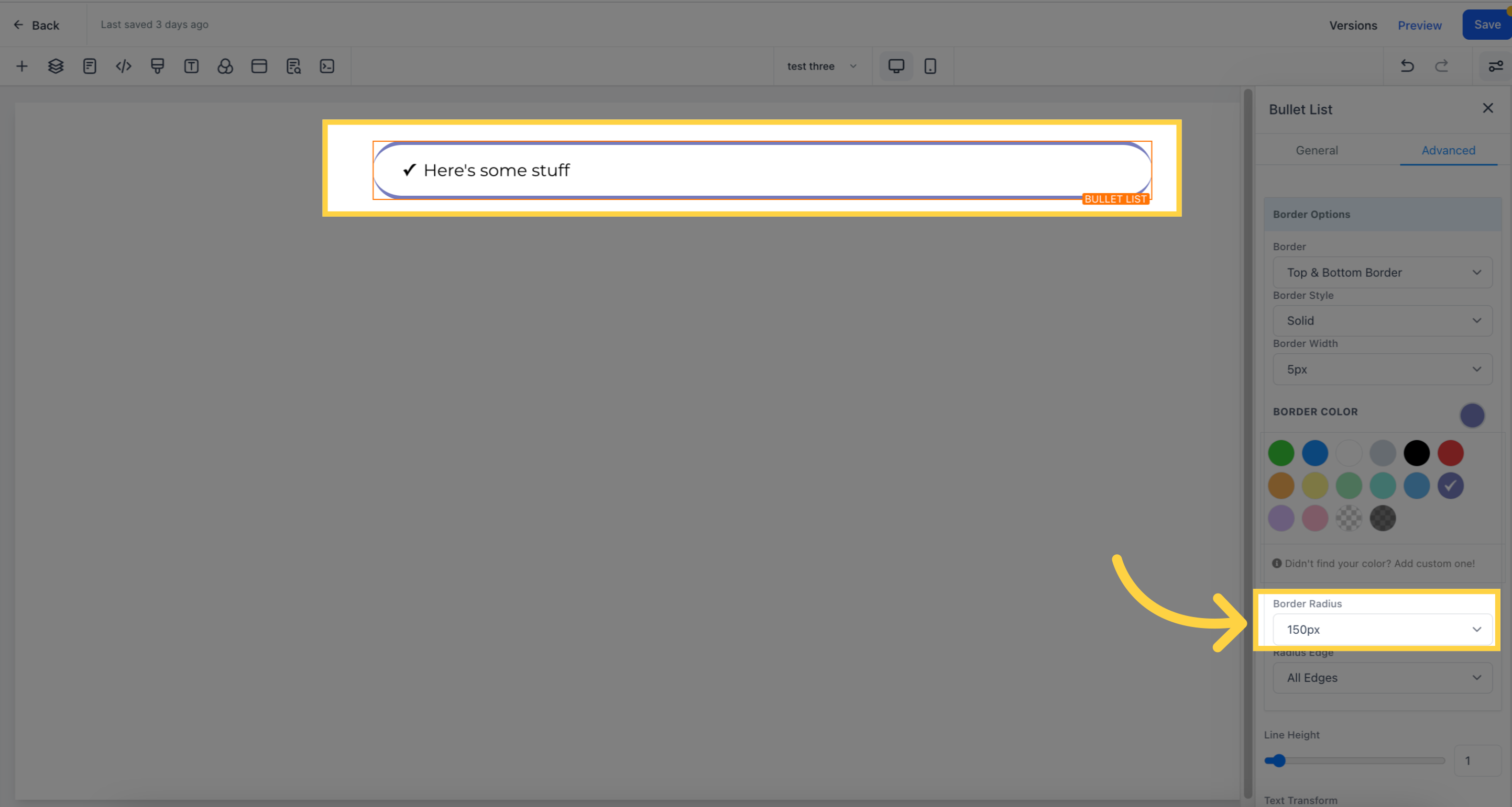
Upon selecting a border type, the border settings will appear, allowing you to choose the desired style.
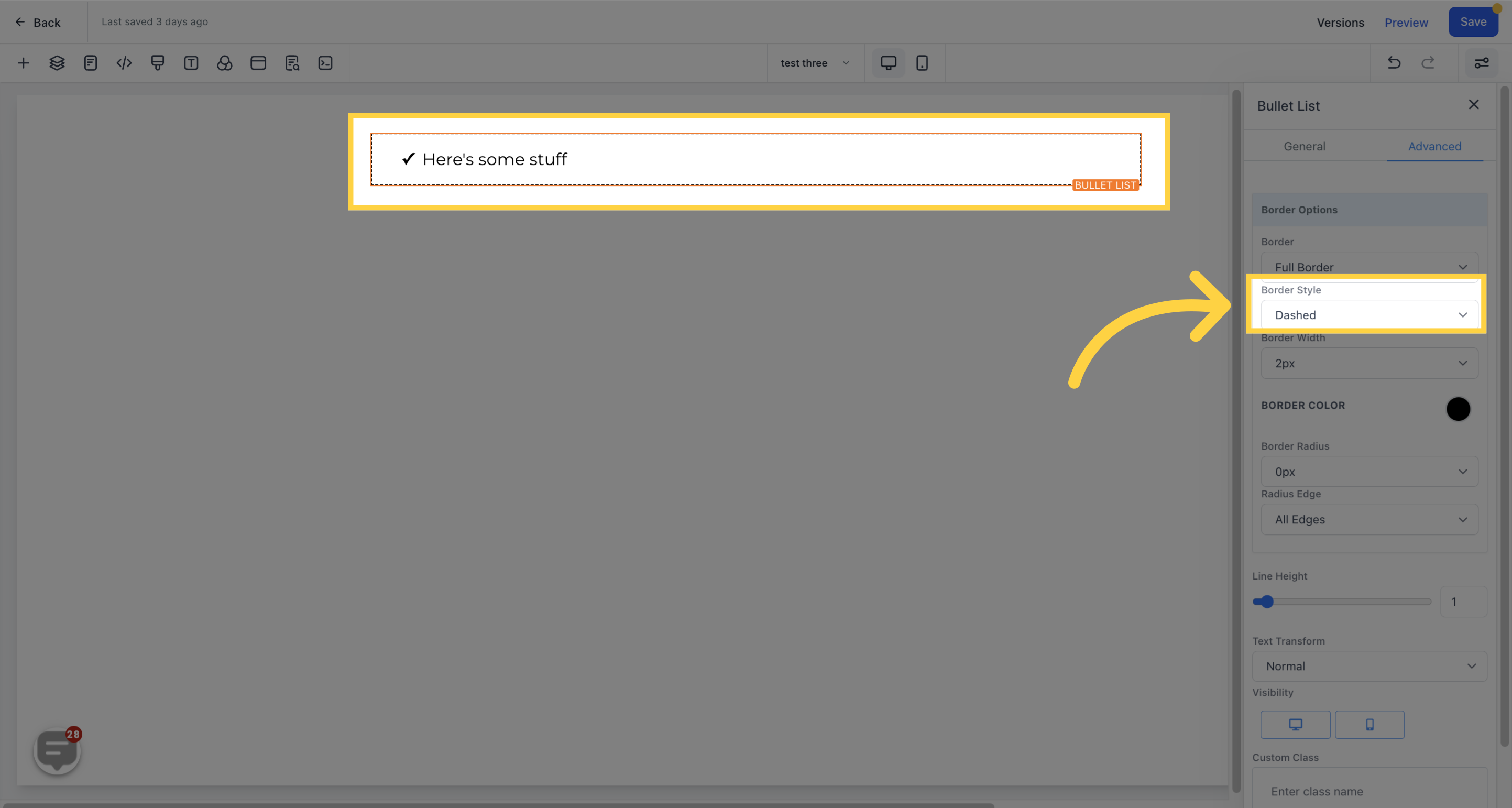
You have the option to choose from three (3) different styles for your border: solid, dashed, or dotted.
Increasing the border width results in a thicker border.
To modify the border's color, simply click on the color icon.

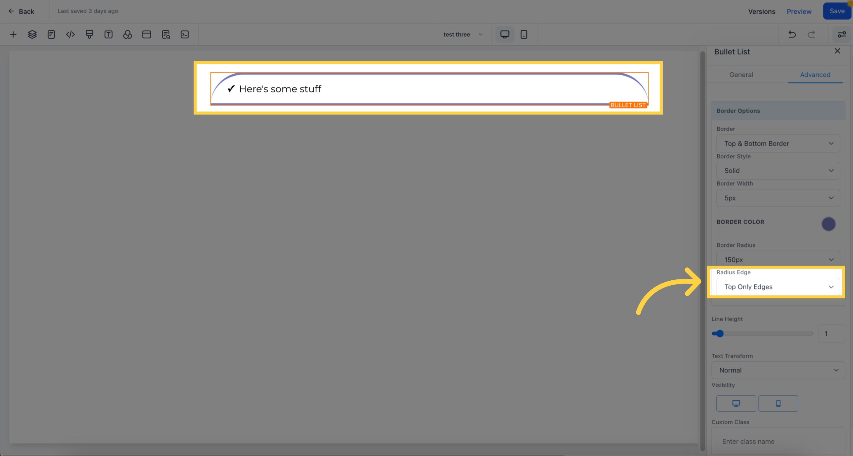
To adjust the curvature of the border, increase the radius setting - the higher the number, the more curved it becomes.
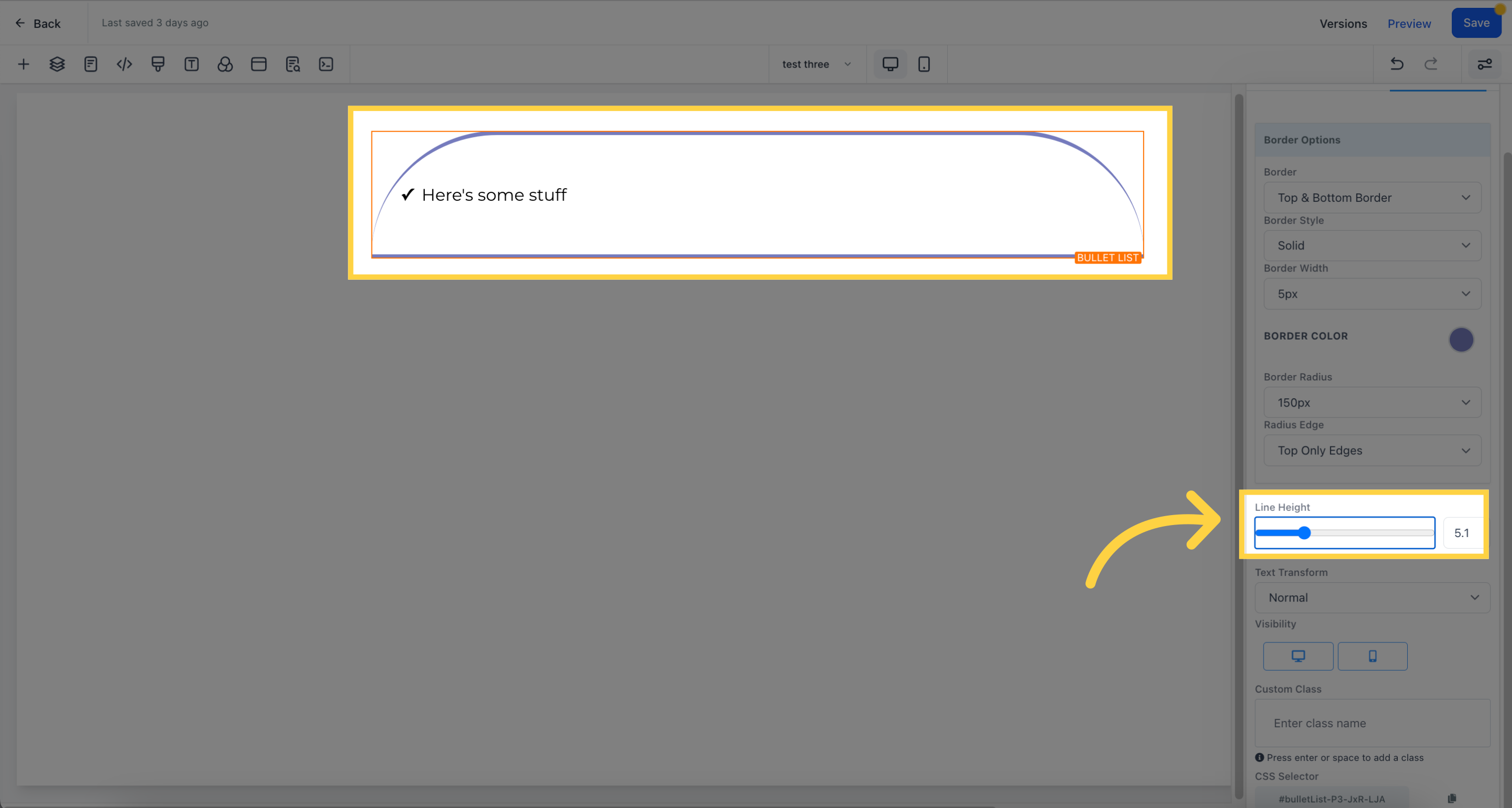
You can choose which corners of the border to curve - all edges, only the top, or only the bottom.
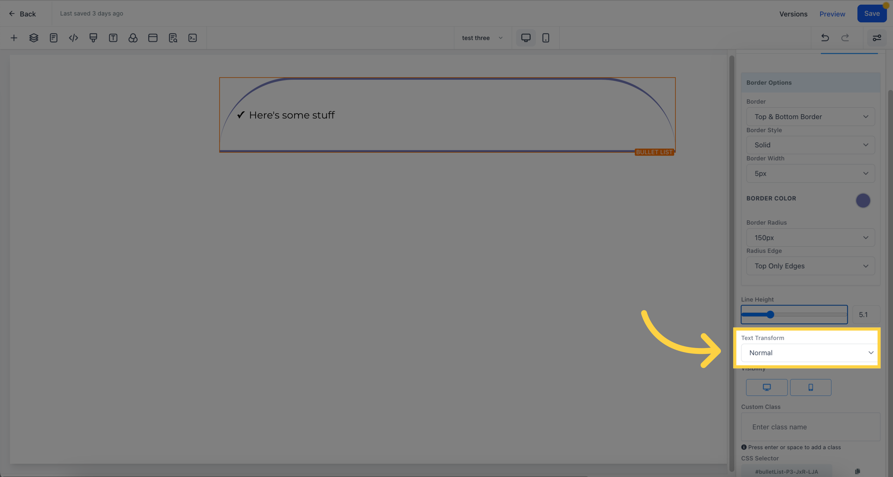
Increase the line height to adjust the height of the element box.
You can transform the text to uppercase, lowercase, or capitalize each word using the Text Transform feature.
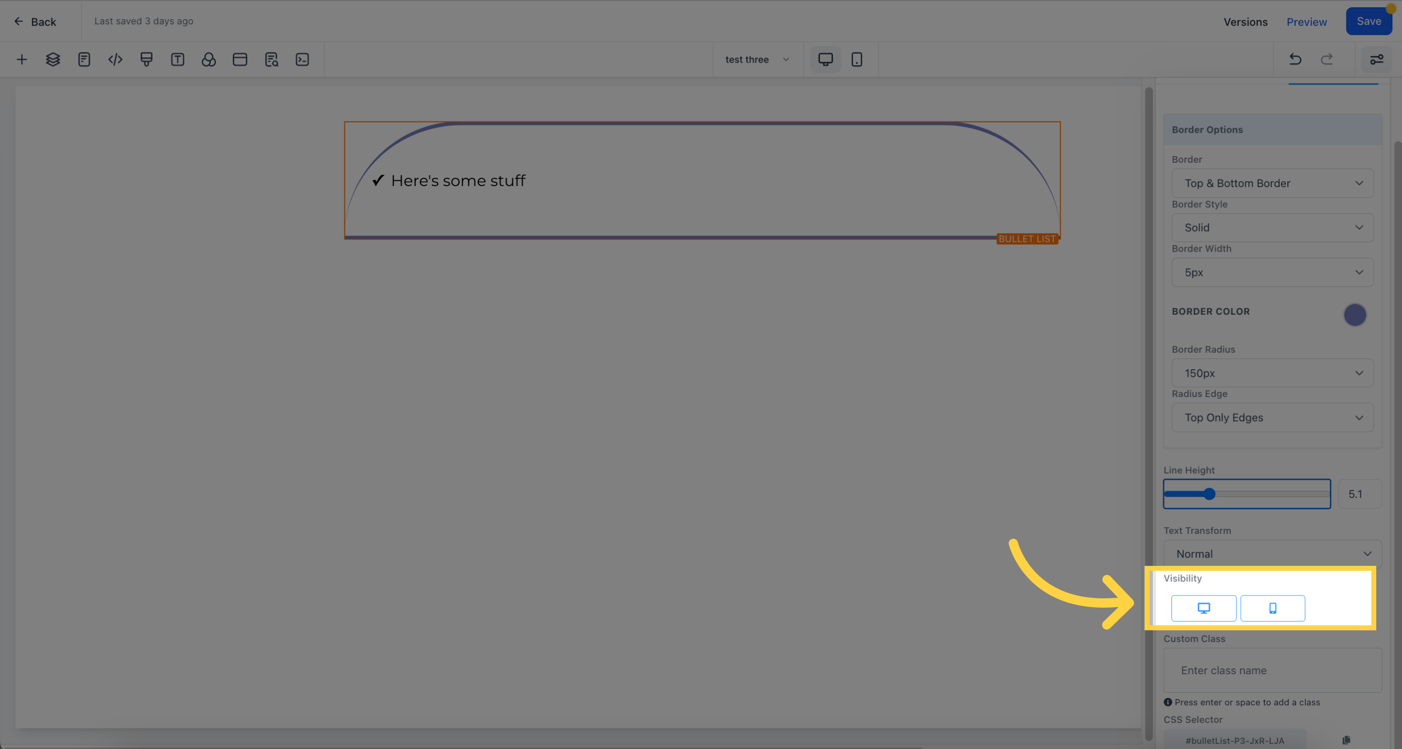
Control the page's visibility on desktop and mobile by selecting the desired option.
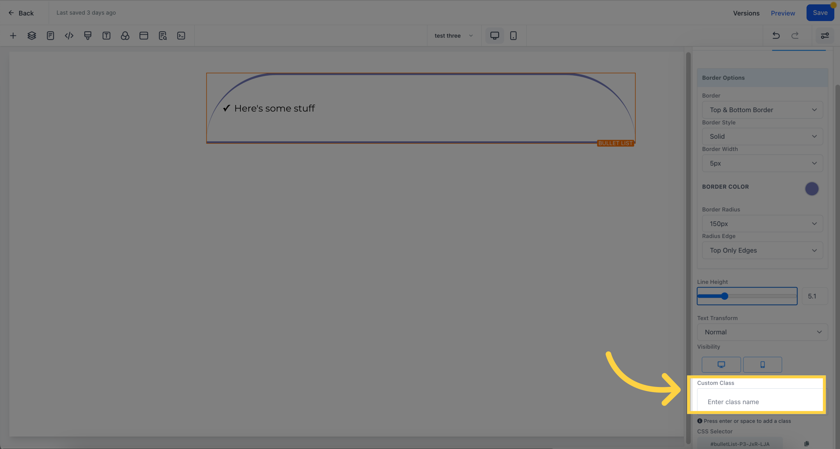
To add a custom class, press enter or the space bar.
Copy a CSS selector by clicking on the "copy" icon next to the reference number.